
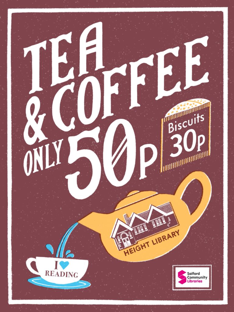
I recently designed a poster to advertise the coffee and tea prices at Height Library. My aim was to create something functional and eye-catching, while also tying into the character of the building itself.
Final Artwork
The finished coffee & tea price poster for Height Library.
The Concept
I wanted this poster to feel like it belonged to the library’s history while still being fresh and inviting. To do this, I based my lettering on the Victorian type carved into the fireplaces inside the building. This connection grounds the design in the library’s heritage, while the poster format makes it useful and approachable for today.
The Style
- Lettering with history: Custom type inspired by the library’s fireplaces gives the design authenticity and character.
- Colour palette: I used vintage-inspired tones with a modern twist, balancing warmth and readability.
- Practical & decorative: While the poster clearly displays the tea and coffee prices, it also acts as a decorative piece that fits seamlessly with the library’s atmosphere.
The Process
In the process video, you’ll see how I:
- Sketched the lettering inspired by Victorian carvings.
- Refined the layout to make the pricing clear and easy to read.
- Chose a colour palette that feels nostalgic yet modern.
- Added textures and finishing details to give the poster warmth and depth.
Final Thoughts
This poster is both practical and expressive. By blending historical influences with a modern colour palette, I wanted it to do more than list prices — it should also communicate the welcoming, timeless spirit of Height Library.
No Comments.